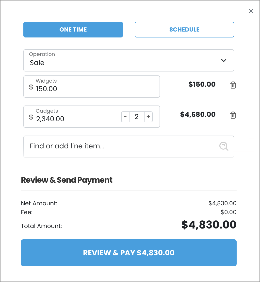
VirtualTerminal UI
The VirtualTerminal UI component lets you embed a payment terminal inside your website or application.
Usage
This component lets you add a robust virtual terminal tool to your pages or apps.
See Library URLs for important information about embedded components library URLs.
Step 1: Include the Payabli component
Add the script to the <body> element of your HTML.
You need to include <meta charset="UTF-8"> in the <head> element of your HTML to prevent problems with special characters such as ‘á’ or ‘ñ’.
Step 2: Define the component container
Add the container to your HTML. This <div> tag is where the page renders the component. The ID is the identifier for rootContainer in your component configuration.
Step 3: Configure the component
Define the component configuration in a script block immediately after component.js and create an instance of the component. See the Configuration section for a full reference of options.
Expand for full configuration example
Response examples
In the response, the referenceId is the transaction ID you can use for other operations.
Configuration reference
These are the configuration parameters available for the VirtualTerminal component.
The component accepts only the data below. If you need to pass more data than what’s supported, consider using the temporary token flow.
This value determines the type of embedded component to render.
Accepted values are: methodEmbedded, methodLightbox, vterminal, or expressCheckout.
For the VirtualTerminal UI, this value is vterminal.
See the Embedded Components Overview for more information on other component types.
Container ID used for the component.
Sets the default payment method that’s shown. Accepted values are: card or ach.
Text label for the action button.
When true the component is hidden when it’s instanced.
API token for authentication.
Complete URL of a custom CSS stylesheet to use with the component.
When true, enables the recurring payment option in terminal.
When true, enables the one-time payment option in terminal.
lineItem objects with data related to the line items for the transaction. See lineItem object model for a full reference.
cardService object used to configure accepted card types.
properties
Enable/disable card option.
Enable/disable acceptance of American Express cards.
Enable/disable acceptance of Discover cards.
Enable/disable acceptance of Visa cards.
Enable/disable acceptance of MasterCard cards.
Enable/disable acceptance of Diner’s Club cards.
Enable/disable acceptance of JCB cards.
Card input fields descriptors. This object applies only to the EmbeddedMethod UI component.
properties
Optional, but strongly recommended. Descriptor object for input field.
Descriptor object for input field.
Descriptor object for input field.
Descriptor object for input field.
Optional, but strongly recommended. Descriptor object for input field.
achService object used to configure accepted ACH types.
properties
Enable/disable ACH option.
Enable/disable acceptance of Checking account.
Enable/disable acceptance of Savings account.
ACH input field descriptors. This only applies to the EmbeddedMethod UI component.
properties
Required. Descriptor object for input field.
Required. Descriptor object for input field.
Required. Descriptor object for input field. Use the
confirm input descriptor to add matching validation to this field. See Style Individual Fields for more.
Required. Descriptor object for input field. Use the
confirm input descriptor to add matching validation to this field. See Style Individual Fields for more.
paymentMethod object with data related to the payment method. Required when saving a payment method or executing a payment. Can be passed to the component via payabliExec method. See paymentMethod Object for a full reference.
Customer Object with data related to customer. Can be passed to the component via payabliExec method. Required when saving a payment method. Which fields are required depends on whether the paypoint has custom identifiers. If you aren’t using custom identifiers, then you must include at least one of these values: firstname and lastname, email, or customerId. See customerData (payorData) Object for a full reference.
paymentDetails object with data related to the payment. Required when running a payment. Can be passed to the component via payabliExec method. See paymentDetails Object for a full reference.
When true, if tokenization fails, Payabli will attempt an authorization transaction to request a permanent token for the card. If the authorization is successful, the card will be tokenized and the authorization will be voided automatically.
The amount for the fallbackAuth transaction. Defaults to one dollar.
The callback function called when the component executes successfully.
The callback function called when the component receives an error. See functionCallBackError response in the next section for a complete reference.
Response object
The Response object received via callback Success function has the following structure:
“Success” or “Declined”
Container for response details.
properties
Authorization code for payments.
Identifier for the transaction (for payments) or the stored payment method (for save payment method).
Result of operation. 1 is success, 2 is declined, and 3 is error.
Message related the result. If the operation was successful, it returns “Added”/“Approved”. If there was an error, it returns error details.
ID for the customer owner of payment or saved payment method.