ExpressCheckout UI
The ExpressCheckout component lets you embed an express checkout for digital wallets inside your website or application.
Usage
This component lets you add a robust low-code way to accept payments from a digital wallet to your pages or apps.
See Library URLs for important information about embedded components library URLs.
Step 1: Include the Payabli component
Add the script to the <body> element of your HTML.
You need to include <meta charset="UTF-8"> in the <head> element of your HTML to prevent problems with special characters such as ‘á’ or ‘ñ’.
Step 2: Define the component container
Add the container to your HTML. This <div> tag is where the page renders the component. The ID is the identifier for rootContainer in your component configuration.
Step 3: Configure the component
Define the component configuration in a script block immediately after component.js and create an instance of the component. See the Configuration section for a full reference of options.
Step 4: Style the component
Information about styling embedded components is available in Embedded Components Overview.
Configuration reference
These are the configuration parameters available for the ExpressCheckout component.
The component accepts only the data below. If you need to pass more data than what’s supported, consider using the temporary token flow.
This value determines the type of embedded component to render.
Accepted values are: methodEmbedded, methodLightbox, vterminal, or expressCheckout.
For the ExpressCheckout UI, this value is expressCheckout.
See the Embedded Components Overview for more information on other component types.
Container ID used for the component.
API token for authentication. This should be a public API token, as described here.
When the API token belongs to an organization, the entrypoint name identifies the target paypoint (merchant).
Complete URL of a custom CSS stylesheet to use with the component.
Configuration for the express checkout functionality.
properties
The amount for the transaction.
The fee for the transaction.
The currency for the transaction.
Define the number of columns to use for digital wallet display.
Card networks to accept payments from. Suggested options:
amexvisadiscovermasterCardjcb
properties
When true, Apple Pay is enabled.
The Apple Pay button style. Supported options:
- “black”: Default black button.
- “white-outline”: White button with an outline.
- “white”: Solid white button.
The text on Apple Pay button. Supported options:
The Apple Pay button locale. Supported options:
- en-US: English (US)
- ar-AB: Arabic
- ca-ES: Catalan
- zh-CN: Chinese (China)
- zh-HK: Chinese (Hong Kong)
- zh-TW: Chinese (Taiwan)
- hr-HR: Croatian
- cs-CZ: Czech
- da-DK: Danish
- de-DE: German
- nl-NL: Dutch
- en-AU: English (Australia)
- en-GB: English (UK)
- fi-FI: Finnish
- fr-CA: French (Canada)
- fr-FR: French (France)
- el-GR: Greek
- he-IL: Hebrew
- hi-IN: Hindi
- hu-HU: Hungarian
- id-ID: Indonesian
- it-IT: Italian
- ja-JP: Japanese
- ko-KR: Korean
- ms-MY: Malay
- nb-NO: Norwegian
- pl-PL: Polish
- pt-BR: Portuguese (Brazil)
- pt-PT: Portuguese (Portugal)
- ro-RO: Romanian
- ru-RU: Russian
- sk-SK: Slovak
- es-MX: Spanish (Mexico)
- es-ES: Spanish (Spain)
- sv-SE: Swedish
- th-TH: Thai
- tr-TR: Turkish
- uk-UA: Ukrainian
- vi-VN: Vietnamese
When this field is true, the following fields ["postalAddress", "name", "phoneticName", "phone", "email"] are required. They will be sent with the payment and can be read through the callbacks.
properties
Height of the button.
Border radius of the button.
properties
Horizontal padding.
Vertical padding.
properties
Customer’s identification number.
Customer’s first name.
Customer’s last name.
Customer’s billing email address.
Triggered when the ExpressCheckout component is ready to use.
Triggered upon successful completion of a digital wallet transaction.
Triggered if an error occurs during the digital wallet transaction.
Triggered if the user cancels the digital wallet transaction.
Response examples
functionCallbackReady response
This response is triggered when the component is ready to use.
When true, the component is ready to accept Apple Pay.
Not in use yet.
functionCallbackSuccess response
When a transaction is successfully completed via the ExpressCheckout component, the functionCallBackSuccess response is triggered.
In the response, the referenceId is the transaction ID you can use for other operations.
“Success” or “Declined”
Container for response details.
properties
Authorization code for payments.
Identifier for the transaction (for payments) or the stored payment method (for save payment method).
Result of operation. 1 is success, 2 is declined, and 3 is error.
Message related the result. If the operation was successful, it returns “Added”/“Approved”. If there was an error, it returns error details.
ID for the customer owner of payment.
Text code describing the result for address validation.
Text code describing the result for CVV validation.
The stored method’s identifier (sometimes referred to as ‘token’) in Payabli. When null, the method wasn’t created, or doesn’t exist, depending on the operation performed.
The billing contact information.
properties
The street portion of the address for the contact. For example: 123 Main Street.
The contact’s state. For example, CA.
Billing country.
The contact’s ISO 3166 country code.
The contact’s email address.
The contact’s family name, also known as last name.
The contact’s given name, also known as first name.
The contact’s city. For example, Los Angeles.
Specifies the pronunciation of the contact’s last name.
Specifies the pronunciation of the contact’s first name.
The contact’s postal code.
The contact’s county or other region.
Additional information associated with the contact’s address.
Shipping address and contact information for the transaction.
properties
The street portion of the address for the contact. For example: 123 Main Street.
The contact’s state. For example, CA.
Billing country.
The contact’s ISO 3166 country code.
The contact’s email address.
The contact’s family name, also known as last name.
The contact’s given name, also known as first name.
The contact’s city. For example, Los Angeles.
The contact’s phone number.
Specifies the pronunciation of the contact’s last name.
Specifies the pronunciation of the contact’s first name.
The contact’s postal code.
The contact’s county or other region.
Additional information associated with the contact’s address.
Boolean indicating whether the operation was successful. A true value indicates success. A false value indicates failure.
Auxiliary validation used by Payabli in payment pages and components.
The payment method used. Possible values include “apple_pay”, “google_pay”, etc.
functionCallBackError response
This response is triggered if an error occurs during the transaction.
The payment method used. Possible values include “apple_pay”, “google_pay”, etc.
Container for error details when an error occurs.
properties
Indicates whether the operation was successful. In error cases, this will be false.
Auxiliary validation used by Payabli in payment pages and components.
The error code. For example, 5005. See API responseCode and resultCode Reference for a full list of error codes.
Additional details about the error.
properties
A detailed explanation of the error.
Suggested action to resolve the error.
A brief description of the error.
Internal field used by Payabli.
functionCallBackCancel response
This response is triggered when the user cancels the transaction while the modal is shown.
Container for response data.
properties
In this field, true indicates that the event was triggered by a user action, such as a user manually canceling the payment process.
The digital wallet method used. Currently, only apple_pay is supported.
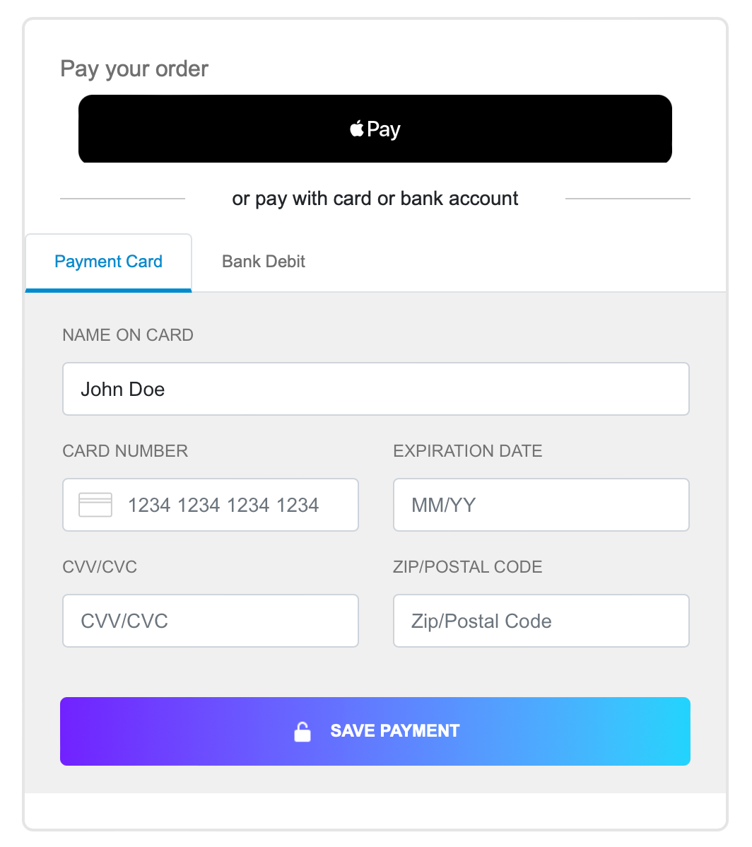
Combine components
If you want to accept digital wallet payments along with card or ACH payments, you can load both the EmbeddedMethod UI and ExpressCheckout UI components on the same webpage. You can also use updateConfig to switch between component configurations on your page.
The code example renders the components in this image: