> For clean Markdown of any page, append .md to the page URL.
> For a complete documentation index, see https://beta-docs.payabli.com/developer-guides/embedded-components-paymethodui/llms.txt.
> For AI client integration (Claude Code, Cursor, etc.), connect to the MCP server at https://beta-docs.payabli.com/_mcp/server.
# PayMethod UI
> **Warning**
>
> Before integrating with this component, we highly recommend reading [Embedded Components Overview](/developer-guides/embedded-components-overview) to make sure you select the right component for your use case, authenticate properly, and understand how to style the components.
>
> This page covers only the configuration unique to this component, and doesn't cover all the basic usage for embedded components.
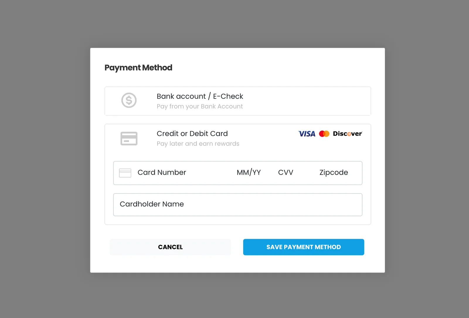
Use the PayMethod UI component to launch a modal that captures a customer payment method for tokenization and returns an ID. Use the ID make future transactions via API with the `storedMethodId` field. Go to [CodePen](https://codepen.io/payablidocs/pen/XWoyQzL) to see a full working example of this component.
\
> **Tip**
>
> This component is supported in the Playground. Use the [Embedded Component Playground](https://playground.payabli.com) to edit and design embedded components in real time, and export the code to use in your own site or app.
## Usage
The PayMethod UI component is a lightbox that's displayed over content, you need an action or an event to trigger a function to display this modal.
> **Info**
>
> See [Library URLs](/developer-guides/embedded-components-overview#library-urls) for important information about embedded components library URLs.
### Step 1: Include the Payabli component
Add the script to the `` element of your HTML.
**`Sandbox`**
```html Sandbox
```
> **Note**
>
> You need to include `` in the `` element of your HTML to prevent problems with special characters such as 'á' or 'ñ'.
### Step 2: Define the component container
Add the container to your HTML. This `
` tag is where the page renders the component. The ID is the identifier for `rootContainer` in your component configuration.
**`Sandbox`**
```html Sandbox
```
### Step 3: Configure the component
Define the component configuration in a script block immediately after `component.js` and create an instance of the component.
*[Skip to the configuration reference section](#configuration-reference)*
In the example below the component modal is hidden by default. In this case you need a button to show the component on demand. Notice that the value for `hideComponent` in the configuration is `true`. This value hides the modal by default.
#### Expand for full configuration example
**`Full configuration example`**
```html Full configuration example
```
You are ready to use the component in your web page.
### Step 4: Style the component
Information about styling embedded components is available in [Embedded Components Overview](/developer-guides/embedded-components-overview#customize-component-styling).
### Response example
For both ACH and card methods, a success response looks like this example. The `referenceId` is the ID you use as the `storedMethodId` in other operations.
See [Handling responses and errors](/developer-guides/embedded-components-overview#handling-responses-and-errors) for more.
```json
response.responseText:
"Success"
response.responseData
{"referenceId":"30e7658e-5c2c-4638-8308-b48edec0718b-1647","resultCode":1,"resultText":"Added","customerId":1647}
```
### Next steps
The PayMethod component tokenizes the payment method, giving you an identifier for the saved method in the field `responseData.ReferenceId`. The identifier is associated with the customer. Use this identifier as the `storedMethodId` in the `paymentMethod` object to submit payments via the API.
## Example: `showModal` and `closeModal`
You can show the component modal by calling `showModal` function, or close the component modal by calling `closeModal` function.
#### Expand to see code example
> **Note**
>
> You can see an interactive version of this example on [CodePen](https://codepen.io/payablidocs/pen/XWoyQzL)
```html
```
## Configuration reference
These are the configuration parameters available for the PayMethod UI component.
> **Note**
>
> The component accepts only the data below. If you need to pass more data than what's supported, consider using the [temporary token flow](/developer-guides/tokenization-temporary-flow).
**`type`** `string` — required
This value determines the type of embedded component to render.\
Accepted values are: `methodEmbedded`, `methodLightbox`, `vterminal`, or `expressCheckout`.\
For the PayMethod UI, this value is `methodLightbox`.
See the [Embedded Components Overview](/developer-guides/embedded-components-overview) for more information on other component types.
---
**`rootContainer`** `string` — required
Container ID used for the component.
---
**`defaultOpen`** `string`
Sets the default payment method that's shown. Accepted values are: `card` or `ach`.
---
**`buttonLabelInModal`** `string`
Text label for the action button.
---
**`hideComponent`** `boolean` — default: false
When true the component is hidden when it's instanced.
---
**`token`** `string` — required
API token for authentication.
---
**`forceCustomerCreation`** `boolean` — default: true
When `true`, the component uses the `customerData` object to create a new customer record.
When `temporaryToken` is `true` and `forceCustomerCreation` is `false`, the component doesn't create a new customer record.
See [Temporary Token Flow](/developer-guides/tokenization-temporary-flow#disable-customer-creation) for more information.
---
**`customCssUrl`** `string`
Complete URL of a custom CSS stylesheet to use with the component.
---
**`temporaryToken`** `boolean` — default: true
When `true`, the token created for the payment is temporary. Set this parameter to false to create a storedMethodId and save the payment profile.
---
**`card`** `object` — required
`cardService` object used to configure accepted card types.
#### properties
**`enabled`** `boolean`
Enable/disable card option.
---
**`amex`** `boolean`
Enable/disable acceptance of American Express cards.
---
**`discover`** `boolean`
Enable/disable acceptance of Discover cards.
---
**`visa`** `boolean`
Enable/disable acceptance of Visa cards.
---
**`mastercard`** `boolean`
Enable/disable acceptance of MasterCard cards.
---
**`diners`** `boolean`
Enable/disable acceptance of Diner's Club cards.
---
**`jcb`** `boolean`
Enable/disable acceptance of JCB cards.
---
**`inputs`** `object`
Card input fields descriptors. This object applies only to the EmbeddedMethod UI component.
#### properties
**`cardHolderName`** `object`
Optional, but *strongly recommended*. Descriptor object for input field.
---
**`cardNumber`** `object` — required
Descriptor object for input field.
---
**`cardExpirationDate`** `object` — required
Descriptor object for input field.
---
**`cardCvv`** `object` — required
Descriptor object for input field.
---
**`cardZipcode`** `object`
Optional, but *strongly recommended*. Descriptor object for input field.
---
---
---
**`ach`** `object` — required
`achService` object used to configure accepted ACH types.
#### properties
**`enabled`** `boolean`
Enable/disable ACH option.
---
**`checking`** `boolean`
Enable/disable acceptance of Checking account.
---
**`savings`** `boolean`
Enable/disable acceptance of Savings account.
---
**`inputs`** `object`
ACH input field descriptors. This only applies to the EmbeddedMethod UI component.
#### properties
**`achAccountHolderName`** `object` — required
Required. Descriptor object for input field.
---
**`achAccountType`** `object` — required
Required. Descriptor object for input field.
---
**`achRouting`** `object` — required
Required. Descriptor object for input field. Use the
`confirm` input descriptor to add matching validation to this field. See [Style Individual Fields](/developer-guides/embedded-components-overview#style-individual-fields) for more.
---
**`achAccount`** `object` — required
Required. Descriptor object for input field. Use the
`confirm` input descriptor to add matching validation to this field. See [Style Individual Fields](/developer-guides/embedded-components-overview#style-individual-fields) for more.
---
---
---
**`paymentMethod`** `object` — required
`paymentMethod` object with data related to the payment method. **Required when saving a payment method or executing a payment**. Can be passed to the component via payabliExec method. See [paymentMethod Object](/api-reference/schemas/paymentmethod) for a full reference.
---
**`customerData`** `object` — required
Customer Object with data related to customer. Can be passed to the component via payabliExec method. **Required when saving a payment method**. Which fields are required depends on whether the paypoint has custom identifiers. If you aren't using custom identifiers, then you must include at least one of these values: `firstname` and `lastname`, `email`, or `customerId`. See [customerData (payorData) Object](/api-reference/schemas/payordata) for a full reference.
---
**`fallbackAuth`** `boolean | null` — default: false
When `true`, if tokenization fails, Payabli will attempt an authorization transaction to request a permanent token for the card. If the authorization is successful, the card will be tokenized and the authorization will be voided automatically.
---
**`fallbackAuthAmount`** `number | null` — default: 1.00
The amount for the `fallbackAuth` transaction. Defaults to one dollar.
---
**`functionCallBackSuccess`** `function`
The callback function called when the component executes successfully.
---
**`functionCallBackError`** `function`
The callback function called when the component receives an error. See **functionCallBackError response** in the next section for a complete reference.
---
**`functionCallBackReady`** `function`
The callback function called when the component change status ready true or false after any input on the component.
---
## Response object
The Response object received via a callback function has the following structure:
**`responseText`** `string` — required
"Success" or "Declined"
---
**`responseData`** `object` — required
Container for response details.
#### properties
**`responseData.ReferenceId`** `string`
Identifier for the transaction (for payments) or the stored payment method (for save payment method)
---
**`responseData.ResultCode`** `integer`
Result of operation. 1 is success, 2 is declined, and 3 is error.
---
**`responseData.ResultText`** `string`
Message related the result. If the operation was successful, it returns "Added"/"Approved". If there was an error, it returns error details.
---
**`responseData.CustomerId`** `integer`
ID for the customer owner of payment or saved payment method.
---
---
> If you're a software company, you're a payments company™